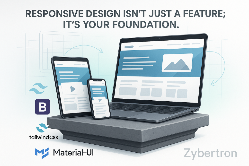
Consider how your customers engage with you online. They might stumble upon your business on their laptop during work hours, explore your services on their tablet while lounging on the couch, and search for your contact details on their phone while out and about. In this world of multiple devices, your website is being viewed on a variety of screen sizes.
The key question is: does it provide a smooth, professional experience on every single one?
If your answer isn’t a confident “yes,” then it’s not just your website that’s at stake; it’s your business. This is where responsive web design steps in. It’s not merely a feature or a trendy extra; it’s the crucial foundation for a modern and effective online presence.
The Seamless User Experience: From First Click to Conversion
A website that isn’t responsive traps mobile users in a frustrating loop of pinching, zooming, and squinting. It’s an awkward, unprofessional experience that signals a lack of attention. Users don’t have the time or patience for that; they’ll simply bounce to a competitor whose site functions smoothly.
Responsive design removes this hassle. It smartly adjusts your site’s layout to fit any screen, making navigation easy, text clear, and buttons simple to tap. This fosters a seamless and enjoyable user experience that builds trust and directly influences your bottom line by making it easy for visitors to take action.
Maximum Visibility: Winning with Google and Your Audience
A while back, Google introduced the concept of “mobile-first indexing.” To put it simply, this means that Google mainly looks at the mobile version of your website when deciding how to rank it in search results. This has huge implications: if your site doesn’t perform well on mobile, your visibility on all devices—including desktops—will take a hit.
Having a responsive website is what Google strongly recommends. By making sure your site is fully optimized for mobile, you’re sending a clear message to the world’s biggest search engine that you’re committed to providing a great user experience. This can lead to improved search rankings, more organic traffic, and a broader audience reach.
Building Brand Trust and a Future-Proof Asset
Your website is a direct reflection of your brand. If your site looks broken or awkward on a mobile device, it can seriously hurt your credibility. On the flip side, a brand that maintains a consistent, polished, and professional look across all platforms is viewed as more trustworthy and reliable.
Plus, responsive design is a smart investment for the long haul. It simplifies development and maintenance since you only have to manage one website instead of juggling separate desktop and mobile versions. This not only saves you time and money but also keeps your digital platform flexible and ready to adapt to new devices and screen sizes in the future.
Conclusion: Quality is Not Optional
In today’s world, you wouldn’t hand a potential client a poorly printed, misaligned business card. Your website deserves that same level of quality. Responsive design is the digital equivalent of that professionalism. It’s the foundation for building user trust, enhancing search engine visibility, and ultimately driving business growth.
At Zybertron, we see responsive design as a fundamental requirement, not just an optional add-on. It’s the standard for every digital platform we create. We build websites on a strong foundation, ensuring your business is set up for success today and ready to seize the opportunities of tomorrow.